TravelingForMiles.com may receive commission from card issuers. Some or all of the card offers that appear on TravelingForMiles.com are from advertisers and may impact how and where card products appear on the site. TravelingForMiles.com does not include all card companies or all available card offers.
Some links to products and travel providers on this website will earn Traveling For Miles a commission which helps contribute to the running of the site – I’m very grateful to anyone who uses these links but their use is entirely optional. The compensation does not impact how and where products appear on this site and does not impact reviews that are published. For more details please see the advertising disclosure found at the bottom of every page.
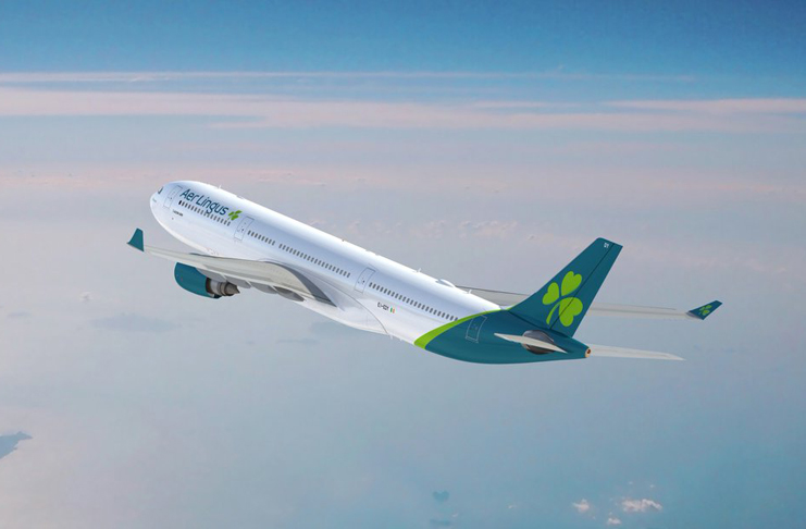
There have been a few leaks across the internet recently but now Aer Lingus has officially revealed the results of its rebranding including a new livery for its aircraft. The rebranding will continue later in the year when new uniforms are unveiled.
It has been 20 years since Aer Lingus has had a brand refresh (if it’s not broken why fix it?) but we’ll soon be seeing the last of the current livery at airports around the world.
Here’s what Aer Lingus CEO Sean Doyle had to say:
“We have evolved from an Irish airline that flies internationally to an international airline that is proud to be Irish. In addition to the new brand identity and livery, we will also unveil a new uniform later this year and will welcome new A321LRs aircraft to our growing fleet.”
“The re-imagining of the Aer Lingus brand reflects Ireland in 2019. A society that is open, progressive, liberal, outward-looking and dynamic, an Ireland that is proudly European and has become the destination of choice for inward investment.”
“The refreshed brand reflects an airline that connects people living in Montreal to Marseilles; in Berlin to Boston; as well as those living in Cork to Croatia.”
Here’s what the anew Aer Lingus livery looks like:
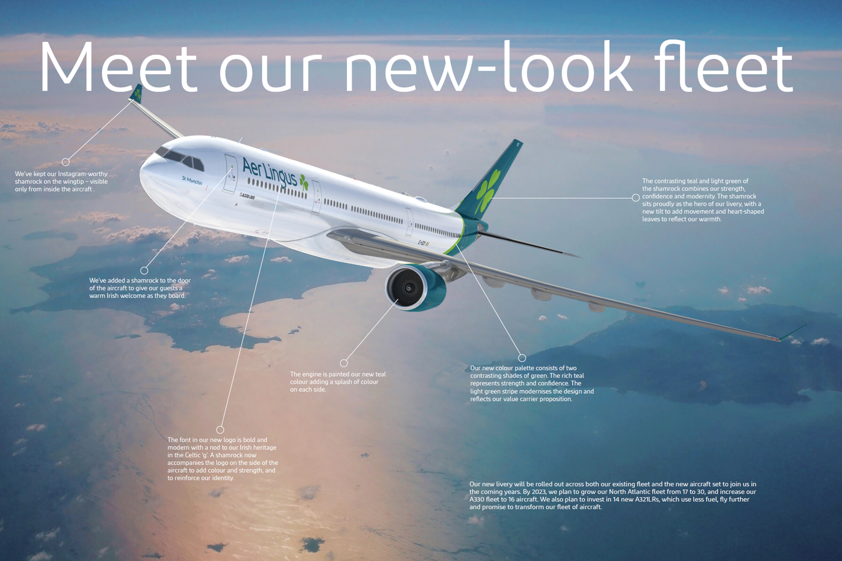
For those of you curious to know what all the lines are pointing at here’s a breakdown:
Aircraft Doors
Aer Lingus has added a shamrock to the door of its aircraft to “give our guests a warm Irish welcome as they board.“
Brand mark
The font in the new Aer Lingus logo is “bold and modern with a nod to [the airline’s] Irish heritage in with the Celtic ‘g’“
A shamrock has been added alongside the logo on the aircraft side “to add colour and strength, and to reinforce [the Aer Lingus] identity“
Engines
The engine has been painted in Aer Lingus’ new color of choice – teal – which wiki describes as a “medium blue-green color, similar to cyan”….so the Irish Emerald Green is history.
Winglets
The airline is keeping the shamrock on the winglets (although they can only be seen from inside the aircraft) – if you can’t remember who you’re flying with just look out of the window!
The Swoosh (under the tail) and the tail fin
Both have been painted with Aer Lingus’ new colour palette of two contrasting shades of green.
Apparently the “rich teal” is there to represent strength and confidence while the lighter green stripe “modernises the design and reflects [Aer Lingus’] value carrier proposition“.
I have to admit that I have no idea how either of those colors does what Aer Lingus claims.
The shamrock
Not even the Aer Lingus shamrock has been left untouched.
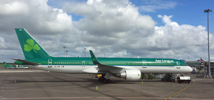
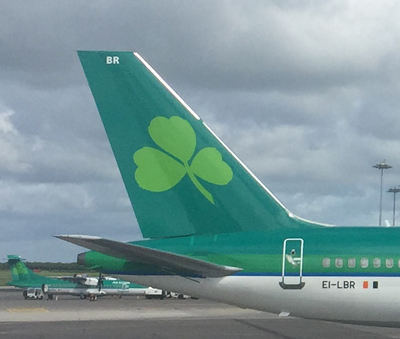
Here’s what it currently looks like on an aircraft tail….
…and here’s the new version:
Not a massive change but, according to Aer Lingus….
“The contrasting teal and light green of the shamrock combines our strength, confidence and modernity. The shamrock sits proudly as the hero of our livery, with a new tilt to add movement and heart-shaped leaves to reflect our warmth.”
Am I the only one who can see “heart-shaped leaves” in the current shamrock as well?
The shamrocks will appear in four areas of each aircraft’s exterior:
- Within the new logo on the aircraft sides
- On the tail fin
- On the door
- On the wingtip
Other Changes In Brief
- Aer Lingus will be rolling out new uniforms later this year
- The airline will be opening its first lounge this year…in Boston
- The Aer Lingus fleet will see the Airbus A321neo LR added to it later this year (and that will herald the introduction of lie-flat Business Class seats on select intra-Europe routes)
Final Thoughts
The new livery looks clean and modern but it also looks a like a lot of other airline liveries out there – white body + colored tail isn’t exactly groundbreaking.
I like the very green livery that Aer Lingus has been using for the past two decades so I’m a little sad to see it go. The passage of time and the takeover by IAG meant that a refresh was always on the cards but I can’t help but feel that a little part of the airline’s identity has been lost here.
Aer Lingus has always come across as an intimate and personal airline and that persona went very well with the airline’s Irish heritage and the incredible amount of green used in the livery – this new livery seems quite impersonal and even a little cold.
I’m glad the shamrock hasn’t been stylised out of all recognition but it’s going to take me some time to get used to the new, modern Aer Lingus.
Anyone else have any thoughts on the new Aer Lingus livery?
Featured image courtesy of Aer Lingus




![Amex Membership Rewards transfer partners & transfer times [2026 edition] a blue sign with white text on it next to green plants](https://travelingformiles.com/wp-content/uploads/2018/09/american-express-1-356x220.jpg)




Tail design is an exact copy of the new LH livery but with their logo.
[…] The airline recently announced a big rebranding which will see its aircraft in a new livery and its crews in new uniforms but the more interesting recent development (for passengers) was the announcement that Aer Lingus would offer lie-flat Business Class seats on select short-haul routes. […]
[…] The airline recently announced a big rebranding which will see its aircraft in a new livery and its crews in new uniforms but the more interesting recent development (for passengers) was the announcement that Aer Lingus would offer lie-flat Business Class seats on select short-haul routes. […]
[…] modern-day liveries are just re-hashed versions of what another airline has already done (like the new Aer Lingus livery) or just very, very bland (take your pick!) so when we see something like this slowly roll out of a […]
[…] modern-day liveries are just re-hashed versions of what another airline has already done (like the new Aer Lingus livery) or just very, very bland (take your pick!) so when we see something like this slowly roll out of a […]